The Problem 💡
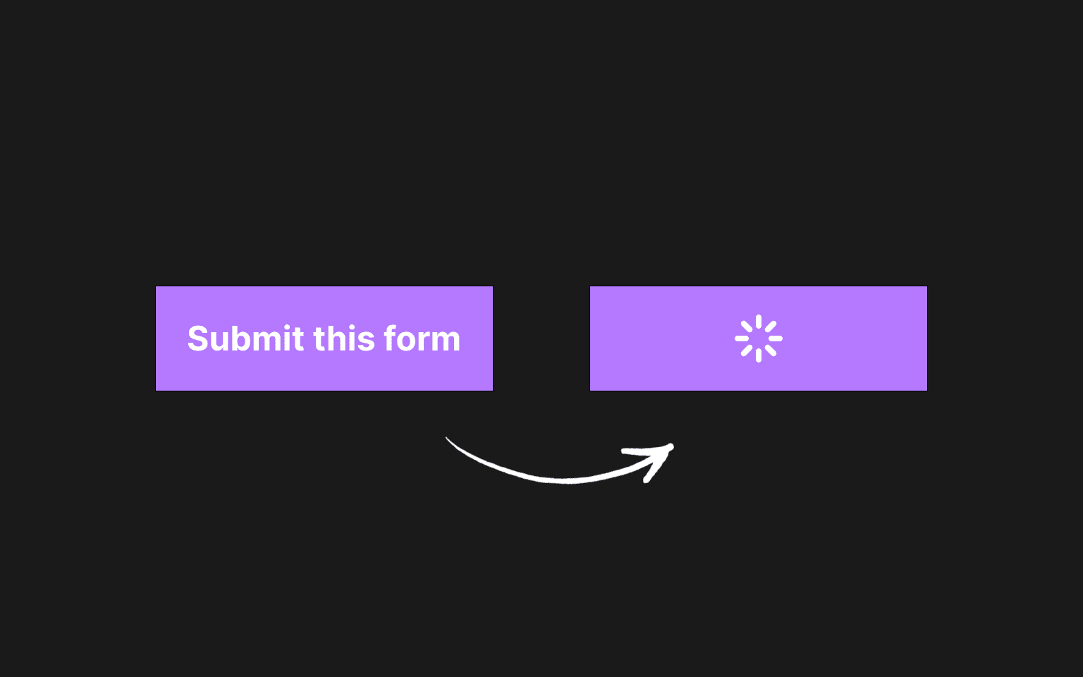
Have you ever encountered a scenario where you needed to implement a loading state for a button, but clicking the button caused it to change size?

Slika: Button with layout shift on loading state
This behavior can look jittery, unprofessional, and not user-friendly. It also introduces layout shifts, which negatively impact your website’s user experience and SEO performance. So, how do you prevent this from happening? How should you approach this problem?
There are two main approaches to solving this issue, but one stands out as the better option. Let’s explore both.
- Absolute positioning approach
- Grid stacking approach
Initial approach
Initially, you might think to render text by default and, when the loading state is active, replace the text with a spinner. Here’s how you can create a basic button component:
1import Spinner from './spinner';
2
3type TProps = {
4  text: string;
5  isLoading?: boolean;
6  onClick: () => void;
7};
8const Button = ({ text, isLoading, onClick }: TProps) => {
9  return (
10    <button
11      onClick={onClick}
12      className='px-4 py-2 bg-purple-500 text-white flex justify-between items-center'
13    >
14      {!isLoading ? <span>{text}</span> : <Spinner />}
15    </button>
16  );
17};
18
19export default Button;
20
As you can see, this is a straightforward button component with an isLoading property that determines whether the text or spinner is rendered.
1'use client';
2
3import Button from './components/button';
4import { useState } from 'react';
5
6export default function Home() {
7  const [isLoading, setIsLoading] = useState(false);
8
9  const handleLoading = () => {
10    setIsLoading(true);
11    setTimeout(() => {
12      setIsLoading(false);
13    }, 3000);
14  };
15
16  return (
17    <main className='grid place-items-center h-screen'>
18      <Button
19        text='Submit this form'
20        onClick={() => handleLoading()}
21        isLoading={isLoading}
22      />
23    </main>
24  );
25}
26
Here’s how you would display the button component.
However, this approach leads to a resizing problem: when text is displayed, the button has a wider size, and when the loading state activates, the button becomes narrower. This is where we need to rethink our solution.
1. Absolute Positioning Approach 📊
To address the resizing issue, you can use absolute positioning. This requires a few adjustments inside the button and spinner components.
1import Spinner from './spinner';
2
3type TProps = {
4  text: string;
5  isLoading?: boolean;
6  onClick: () => void;
7};
8const Button = ({ text, isLoading, onClick }: TProps) => {
9  return (
10    <button
11      onClick={onClick}
12      className='px-4 py-2 bg-purple-500 text-white flex justify-between items-center relative'
13    >
14      <span className={`${isLoading ? 'invisible' : 'visible'}`}>{text}</span>
15      {isLoading && (
16        <div className='absolute inset-0 w-full flex items-center justify-center'>
17          <Spinner />
18        </div>
19      )}
20    </button>
21  );
22};
23
24export default Button;
25
The changes include adding the relative class to the button, modifying how button text is rendered during the loading state, and wrapping the Spinner component with an additional container.
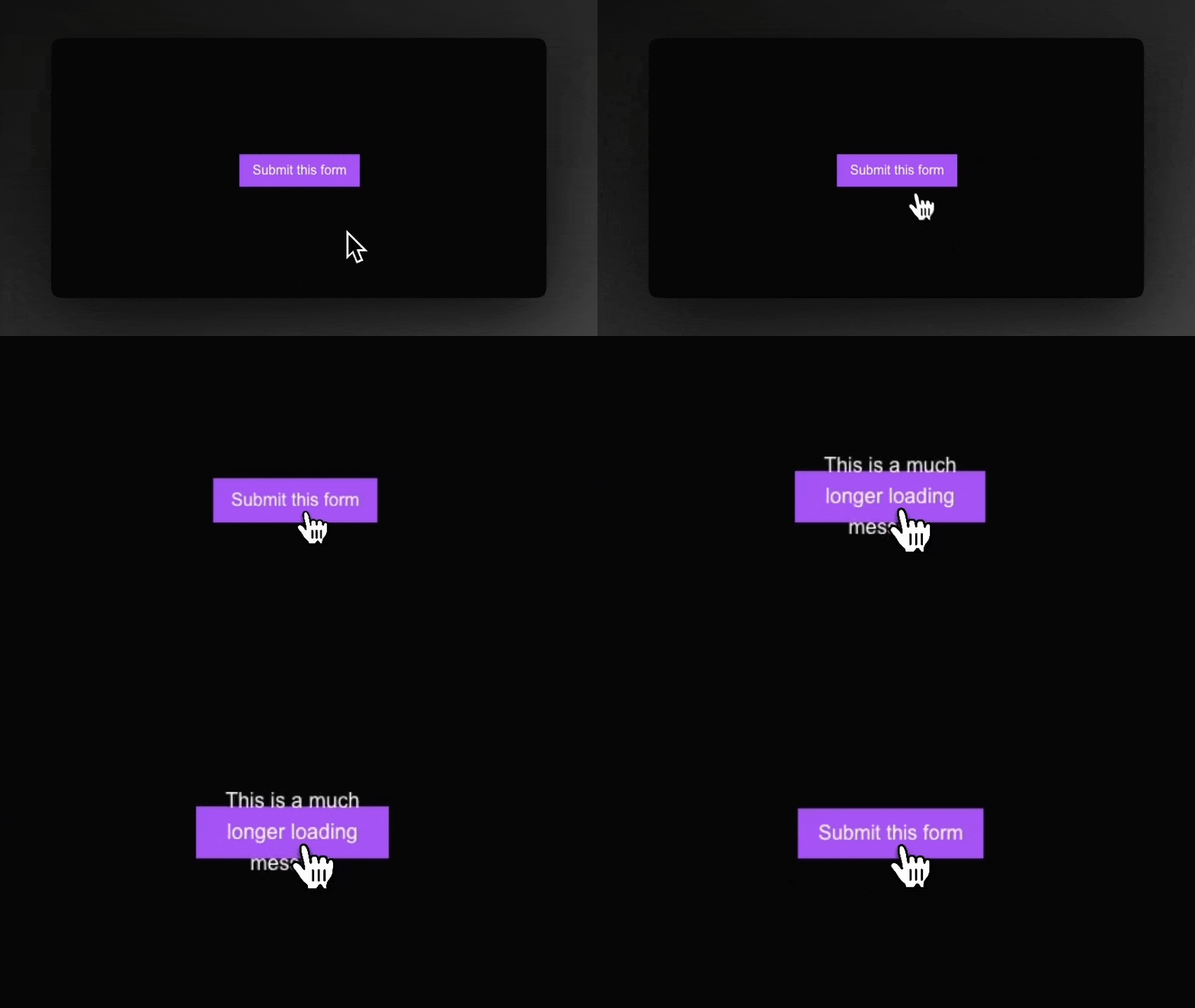
But what’s the drawback of this approach? While it resolves the resizing issue, it introduces a new problem - text overflow.

Slika: Problem with a absolute approach
As you can see, when you have a loading state message that is bigger than the initial button text, then you have a problem with text overflow. How can we possibly fix this problem?
2. Grid Stacking Approach 🌐
As shown here, if your loading state message is longer than the initial button text, it causes text overflow. To fix this, we need a better solution.
1import Spinner from './spinner';
2
3type TProps = {
4  text: string;
5  isLoading?: boolean;
6  onClick: () => void;
7};
8const Button = ({ text, isLoading, onClick }: TProps) => {
9  return (
10    <button
11      onClick={onClick}
12      className={`px-4 py-2 bg-purple-500 text-white grid [grid-template-areas:stack]`}
13    >
14      <span
15        className={`[grid-area:stack] ${!isLoading ? 'visible' : 'invisible'}`}
16      >
17        {text}
18      </span>
19      <Spinner
20        className={`[grid-area:stack] place-self-center ${
21          isLoading ? 'visible' : 'invisible'
22        }`}
23      />
24    </button>
25  );
26};
27
28export default Button;
29
First, you need to add grid as a className to the button, enabling CSS Grid layout. The key className here is [grid-template-areas:stack], which defines a single grid area called stack. This ensures all child elements stack on top of each other.
To make grid-areas work, apply [grid-area:stack] to both the button text and the Spinner component. Additionally, use classNames like visible and invisible to toggle the visibility of the elements as needed.

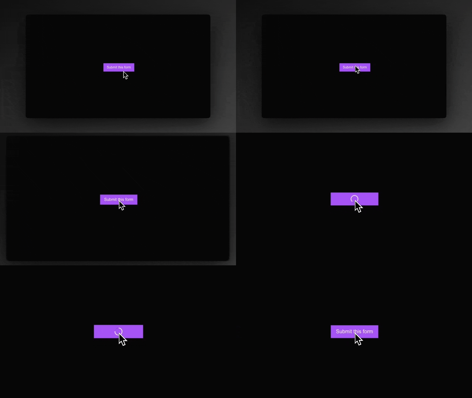
Slika: Grid stacking approach output
The spinner output remains identical to the absolute positioning approach. However, grid stacking offers a significant advantage.

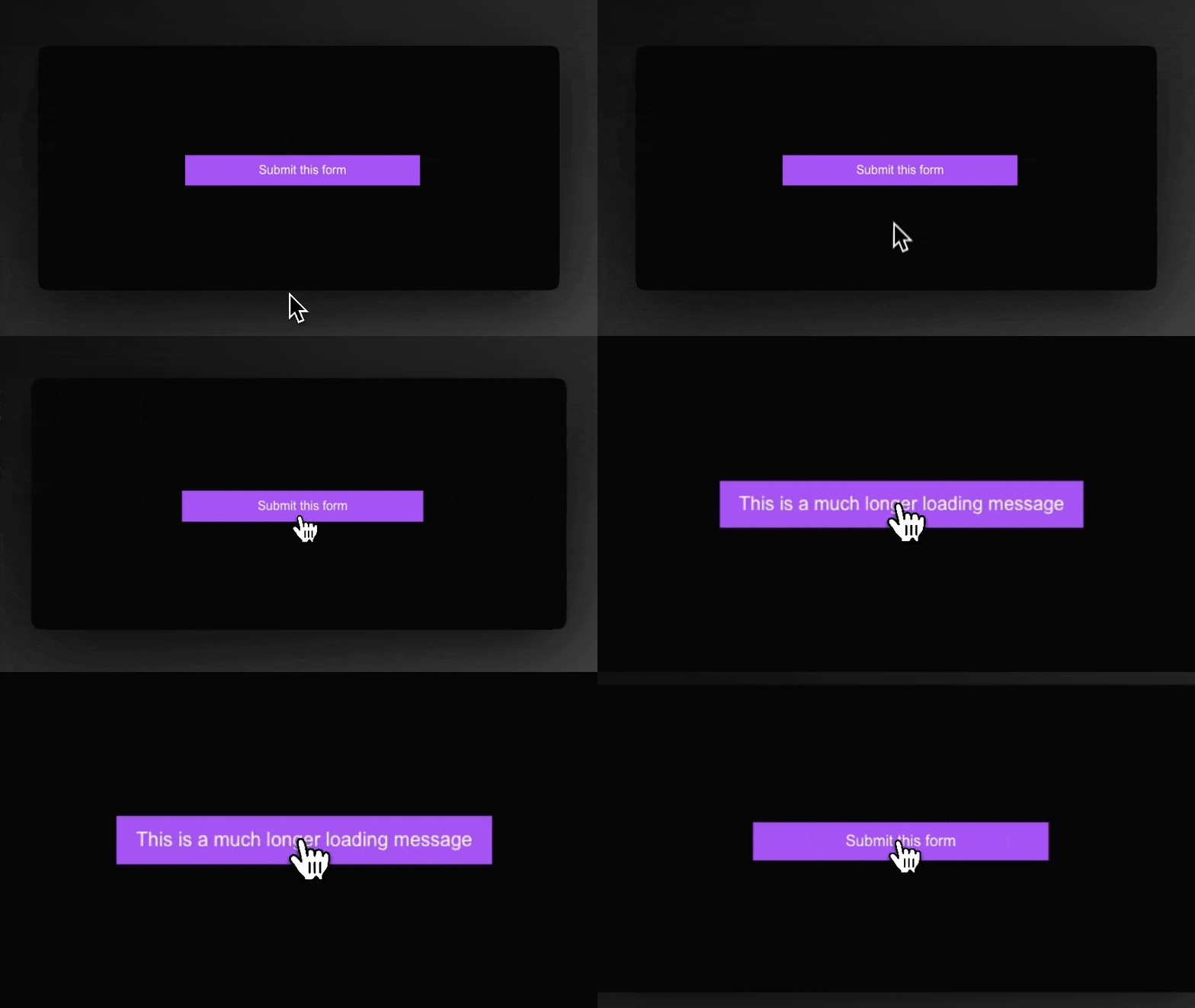
Slika: Grid stacking approach with longer message
As illustrated, the grid-based approach considers the largest child element when determining the button size. This means the button’s initial size already accommodates the longer loading message, preventing layout shifts.
Conclusion 🔧
This blog post has detailed two approaches for addressing button resizing issues during a loading state: absolute positioning and grid stacking. While absolute positioning offers a quick fix, grid stacking emerges as the superior solution by avoiding text overflow and layout shifts, thus improving user experience and maintaining SEO performance.
At AS Agency, we meticulously address these nuances to ensure our clients’ websites are polished, user-friendly, and optimized for the best performance. If you’re looking for a team that prioritizes every small detail to deliver exceptional results, look no further. Let’s create something amazing together! ✨

